
The email from the publisher began:
“We have now begun the production cycle for your book, Wish I Was Here. Your submitted final manuscript has been professionally formatted into a custom PDF bookblock and attached here for your review.”
I had been texting with a coworker when this email popped up, prompting me to hastily exit that conversation and clock out of my day job.
The cover was also attached. Naturally, I began there. Oh, how I wish I could show you the cover, but it’s still a work in progress. When I saw it, I didn’t hate it. But I didn’t love it.
I sent it to my Faithful Few for feedback. (Isn’t it wonderful when alliteration happens naturally?) I got varied responses:
- “He’s way too heart-throbby.”
- “He kind of looks girly.”
- “He looks like a surfer dude not a nerd.”
- “Is that hair regulation length?”
- “He looks 30.”
- “He looks 40.”
Maybe I shouldn’t have asked?
But, actually, I’m glad I did. I need to know what the readers think. The age on the guy was a big concern, for sure. I also wasn’t super fond of the look of my main girl. I was willing to let some of this go, but then…
When it’s your baby, don’t you want it to be perfect?
In my experience, the publisher gives you a cover. The end. But could I push back a little? Turns out, I could, probably to the point of driving the poor design guy crazy. He sent four drafts in one day. I still wasn’t happy.
I sent a couple more emails, one being a link to the image of the girl I DID want. Then the weekend hit, and I’ve heard nothing back since.
I’d rather not have a pic of the non-final cover floating around the internet, but the back isn’t likely to change, so:
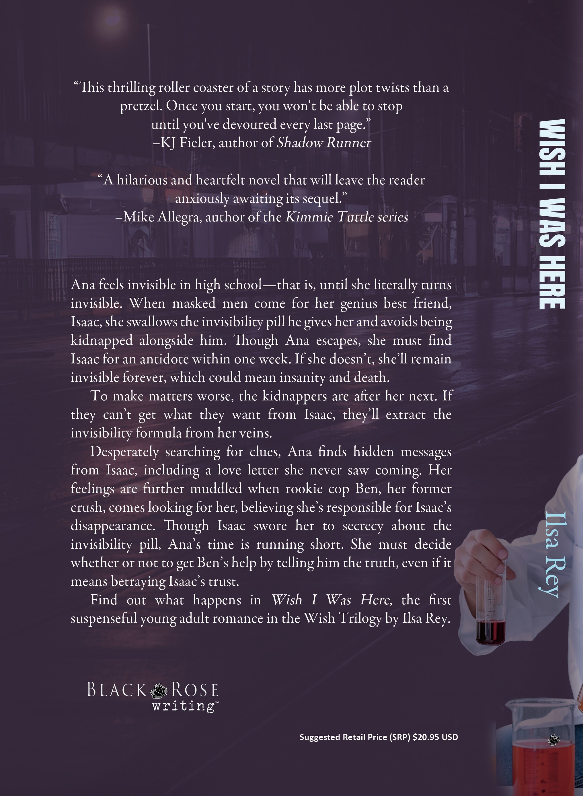
The bookblock
I spent the weekend reading the pdf. Having been more recently immersed in the sequel, it had been months since I’d looked at Wish I Was Here.
What a difference several months make! I caught mini plot holes that had sailed by my readers and me. Twice people say something they couldn’t yet know. One guy, only mentioned twice, has a different first name each time. (Face palm!) I discovered something cool I had forgotten about and made note of to definitely utilize in book 3.
In total, I had 44 changes, either to issues with layout, or issues with the writing, which I should have caught sooner. Either way, I hoped these weren’t too many.
I tried to ease the blow and ingratiate myself to the layout guy (same as the cover guy! Gulp.) by attempting humor. For instance, in a spot where a paragraph was split, I wrote, “They should be rejoined like Luke and his lightsaber.” Maybe not the best, but should be relatively universal.
In the midst of my reviews, I found myself second guessing what I’d written. My two key editors put themselves at my disposal to weigh in on commas and word choice. One day saw a flurry of emails, and they responded quickly. SO GRATEFUL!
I mean, there’s nothing in it for them beyond a thank you in the acknowledgements and the ability to read the book early and for free–if that matters to them at all.
The fact that they care, especially the one whom I’ve never met IRL (yet), means a lot. Thanks, man. Truly.
Despite all the work, I know stuff is still going to get missed. I find mistakes in traditionally published books all the time. I’m just going to do my best and accept that it still won’t be perfect.
Here’s another preview:
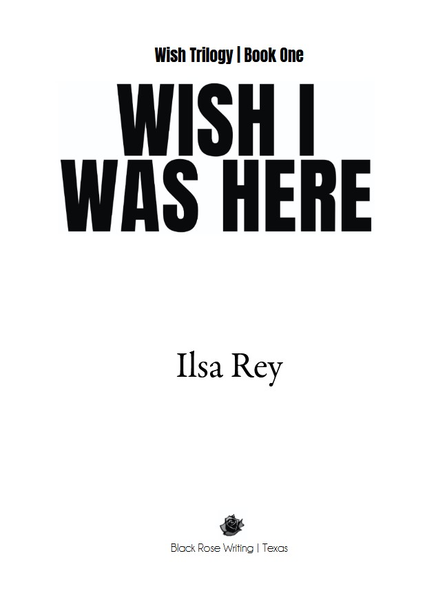
For reasons unknown, the adjective that came to mind when I saw this title page was: “sexy.” It’s becoming so REAL now. Not only that, the publisher put book 1 of the Wish Trilogy on top. That’s like tacitly acknowledging they’ll take on the other two. Most publishers take a wait-and-see approach. If book one doesn’t do well, they’ll drop you to self-pub the rest, or whatever. I suppose that’s still possible here, but their forward-looking approach is promising.
The Launch Party
Meanwhile, Greg the Guitarist has asked three times about booking the launch party. I know the date I want (9/20) to combine it with my birthday, but I fear not having the books in time. Not sure how much longer I can hold off before the venue books (heehee, puns) or the band is busy.
The book releases December 23, but I should get copies three months early. That’s cutting it close. Too many things still need to fall into place. Exciting but a little stressful. If I have to do the launch party in, say, November, so be it. But then it will be chilly. Ugh.
So, for now I wait “patiently” and see what shakes out. And hopefully I’ll have a cover to show you soon!

Last Q: In the French dub of Back to the Future, Marty is called Pierre Cardin instead of Calvin Klein.
New Q: Passing the earth in July 2015, the half-mile Asteroid 2011 UW-158 is thought to have a 100-million-ton core of this metal worth $5.4 trillion.
Discover more from Writing and Martial Arts
Subscribe to get the latest posts sent to your email.

Date noted (in pencil) on my calendar!
Covers matter.
LikeLiked by 1 person
Thank you, Janis. You’re the best!
LikeLiked by 1 person
Hi – that is cutting it close with dates and I liked seeing the samples you were able to share here.
My thought about the characters is – do you have to have photos of them? Sometimes I hate when there are photos, real, sketched, or now all the AI, and really get tired of certain stereotypes in the images (long lashes and big lips for the girl – a certain jaw line for the guy…. hm
but if you and the publisher want that couple on depicted I guess it is good – but I like not seeing mages because then I can have my own image from what is written about them?
LikeLiked by 2 people
I feel like I need to have the people. Teen audience, after all. They want faces. It’s tough, though, because my editor friends were a bit thrown. The guy didn’t look like they imagined. They read the book first. Most readers will see the cover and then use that to form the basis of what the characters look like. I’m trying to get the cover to match how they’re described in the book. Trickier than expected.
LikeLiked by 2 people
oh that makes sense then – and hope the characters can get to look that way – and it seems like you really know what you are doing with this project – and you have some good support – how awesome
LikeLiked by 1 person
Thanks, Prior! 🙂
LikeLike
So cool! I have this book idea in my head, thinking about if for about a year now – and still haven’t written a single sentence, because I don’t even know where and how to start 🤦🏼♀️😉
LikeLiked by 1 person
You start by just writing! I rewrote my opening about 20 times. It doesn’t matter how you start so long as you start. Everything will wind up getting changed a bit eventually, so get your crappy first draft done now. I had multiple crappy drafts. All part of the process. 🙂
LikeLiked by 1 person
Sounds good! I just never have written longer things, my background is in journalism and marketing/PR, a whole book feels so overwhelming. But you are right. Baby steps. Maybe time to finally get started 😉
LikeLike
Totally. Just get started, and give yourself some grace. It doesn’t have to be remotely perfect until the 30th draft. 🙂
LikeLike
Congrats on being one step closer. Covers really do matter, so make sure you are happy with it.
I am guessing the asteroid was filled with bookstoogeite. Even one pound of that stuff is priceless(to me!) so a hundred million tons would be a treasure beyond compare 😉
In reality, copper maybe?
LikeLike
Bookstoogeite is the correct answer! You’re amazing!
I’m going to do my absolute best to be happy with the cover.
(P.S. Not copper.)
LikeLiked by 1 person
Woohoo! Exciting, exciting news! Thanks for sharing and for what it’s worth, dig in as much as you want to about the cover! I totally get that. 🥰
LikeLike
Thanks, Vicki! I’m digging, but also trying to tread lightly. It’s a fine balance. We’ll see what shakes out!
LikeLiked by 1 person
I bet…but I know you’ll make it work! Sending love! 🥰
LikeLike
What an exciting update, Betsy! 😍 You are one step closer to launching your hard work to the world. It’s very nice that you have a trusted circle to get feedback from, even if it’s not what you may expect. 😆 I can’t wait to see the final cover now.
I’m in the camp that you need to champion for your vision and so I think you’re right to share your feedback on the cover. 👍
LikeLiked by 1 person
Thanks, Ab. I’ll probably have to accept that I can’t get the cover juuuuuuussstttt right, but I don’t know how to design covers myself, so I’m just grateful there’s someone doing (I assume his best) for me. (That was a run-on sentence. Ah well. 😛 )
LikeLiked by 1 person
How exciting!!
LikeLiked by 1 person
It is! Thanks. 🙂
LikeLiked by 1 person
A trilogy? You are ambitious. How cool is it that your book [with only 44 corrections] is almost a reality!
LikeLike
There’s just more that needs to happen before these poor characters find resolution. I’m not quite sure what’s going to happen yet, but I’ll get there! 😛
I hope there are only 44 corrections and not, say 64 because I’ve missed 20. I also hope there aren’t 44 corrections to be made to the cover!
Thanks, AB!
LikeLiked by 1 person
I think your book will be a great read, Ilsa, and am looking forward to reading it.
LikeLike
Thanks, Tim! Hope so! 🙂
LikeLiked by 1 person
🌞 😎
LikeLiked by 1 person
wow, I give you credit, having to endure this process may be more painful than your marital arts classes!) don’t worry, we know you’re a fighter and will make it to the end, you’re closer tot tend than the beginning at this point. as for the metal – maybe, gold or platinum? I’m going to guess gold.
LikeLiked by 1 person
Heehee. Hard to compare. It’s a different kind of pain. 😛
Go with your other metal guess! 😉
LikeLiked by 1 person
I’m going to guess platinum!)
LikeLiked by 1 person
There you go! Nailed it, Beth. 😛
LikeLiked by 1 person
Second time is the charm!
LikeLike
Yep! Who needs a third? Not you! 😛
LikeLiked by 1 person
How exciting! The book sounds awesome, can’t wait to read it!
LikeLiked by 1 person
Thanks, Theresa! 🙂
LikeLike
It must be an exciting process seeing something you created come to fruition. And yes, being an avid reader… I can honestly say covers definitely matter. Sometimes it’s the only reason I give a book a second look.
LikeLiked by 1 person
Oh for real. Even though they say, “Don’t judge a book by its cover,” we all literally do. 🙂 Thanks, RG!
LikeLiked by 1 person
Very exciting book news, and how fabulous that you literally have a series. Bummer about the cover, though. I, too, didn’t think an author had any say in the cover, so it’s pretty impressive that you do.
LikeLiked by 1 person
It seems to depend on the publisher. I worked with two in the past. The second one I had to fight for a new cover. They originally said, nope, you get what you get. But I pushed back. Then I was told the old and new cover were shown around the office and the new cover was unanimously chosen. So there. 😛
But this is a small press–much better about working with their authors. That’s a nice thing.
And you mentioned a series. TBH, I hope that I can finish this story out in three books so I don’t make myself a liar with that “Wish Trilogy” bit. Still not sure what’s going to happen in book 3. 😛
LikeLiked by 1 person
Platinum. Me and a few of my engineering friends are trying to figure out a way to capture it in orbit around the earth and mine it. We’ll be selling shares in our venture soon.
and I’ve always walked a middle line around editors – they part useful and part annoying. The part where they are often right really annoys me …
LikeLiked by 1 person
Lol. Sign me up! And, yeah, editors who are good at their jobs are so annoying. 😉
LikeLiked by 1 person
I had no idea you were this far along. Bravo!
LikeLiked by 1 person
Thanks, Jacqui! Yep, it’s coming. 🙂
LikeLiked by 1 person
You’re welcome. 🙂
I’m kinda glad my cover only features boats, helicopters, and a planet. I’m sure I’d be similarly unhappy with what the graphic artist thinks my characters look like vs. what I know they look like.
Since invisibility is key, why not have their faces look transparent on the cover? Hard to distinguish? Floppy hair and all? (Not that you need to go back to the designer with yet another request!).
I was going to guess molybdenum, which is very random, but Andrew seems pretty confident it’s platinum.
LikeLike
You definitely lucked out with your cover. No one likely complained that your helicopter had wrinkles or that your boat’s hair was too long.
The girl is pseudo-transparent. She was more so originally, but I didn’t like the look of that, so now it’s just her hair that fades out. I wanted her face to still stand out from the cover. I should double check that her clothes are faded on the edges too. Dang it! Now that’s another critique I may have to make.
Molybdenum is a thing? Sounds like something only Isaac would know. 😉 And, yep, Andrew knows his stuff.
LikeLiked by 1 person
Molybdenum actually figured in MY novel, ha!
LikeLike
Ha! Awesome!
LikeLiked by 1 person
Wow, Betsy, look at you.. sorry about the cover but hey you’re doing this! 🙌🏽
LikeLiked by 1 person
I am! Thanks, Cindy! 🙂
LikeLiked by 1 person
You’re so very welcome!!!! 💕
LikeLiked by 1 person
❤
LikeLiked by 1 person
Best wishes on your book. I have no idea on the asteroid content.
LikeLiked by 1 person
Thanks, John! And I’ll bet you can get it. Think expensive metal. 🙂 That’s all I’ll say.
LikeLike
I just looked at The Producers hand and Platinum came to mind. Must be Kismet.
LikeLiked by 1 person
There you go, John!
LikeLike
Very cool to read about the editing and publishing process as it happens. For most of us all these behind-the-scenes chapters are a complete mystery. You buy the book and wonder how it ever got from the author’s brain to the bookstore shelves. The step I DO relate to is rereading what you wrote and making changes. I’m convinced that process would never end if you didn’t find something else to distract you (sequels are convenient for that). I relate with my blog posts. I could go back to one of them I wrote years ago and I guarantee I’d want to make changes.
That’s a heckuva trivia question, Ilsa. Like Beth, I’m thinking platinum. Silver and gold seem a little ordinary in this instance.
LikeLiked by 1 person
Thanks, Dave. It’s nice to know someone cares about the “behind the scenes” aspect of publishing. It’s been an interesting learning experience for me too. And–agree. I look back on old blog posts and find typos and other stuff I want to change. Do you know that old quote by Paul Valéry: “A poem is never finished, only abandoned”? I relate to that so much.
You and Beth are correct. 🙂
LikeLiked by 1 person
Hope you get the book cover that makes you happy. The back cover says “Take me home” 🙂 All the best with your launch party plans!
LikeLiked by 1 person
Thank you, Rosaliene. 🙂
LikeLiked by 1 person
How exciting — and what a captivating back cover. So amazing to see things come all together. So delighted for you, my thriller author friend!
LikeLiked by 1 person
Thank you, Wynne! I don’t know that I qualify as a thriller author, but hopefully reading the book will be thrilling! 🙂 🙂 🙂
LikeLiked by 1 person
Own it!
LikeLike
Heehee. Okay. Still looking forward to your reaction to it.
LikeLiked by 1 person
I’m really happy for you and find the process very interesting as well. Keep keeping us posted.
LikeLiked by 1 person
Awh, thanks, Herb. I’m glad to hear it. 🙂
LikeLiked by 1 person
This is so exciting, I can’t believe how long the process is to publish a book. I hope you become a best seller!
LikeLike
Oh, it takes ages. Gah! And thanks, Diane. That would be neat. 🙂
LikeLike
How exciting! The plot sounds very intriguing! Good luck as you finalize your edits. Hope cover guy turns out to your liking!
LikeLiked by 1 person
Thanks, Sheep! I hope that too! 🙂
LikeLike
This is incredibly exciting! I’m amazed at how lengthy the book publishing journey is. Wishing you great success and hoping your book becomes a bestseller!
LikeLiked by 2 people
Thanks very much! 🙂
LikeLike